OK, hit me...

Users who are viewing this thread

Leananshee

Active Member
Messages
1,268
Reaction score
0
Tokenz
0.00z
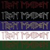
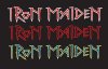
This is for a corporate identity class. I have to reinvent a company logo and justify it based on company research. So I thought I'd take another stab at the Iron Maiden logo I was working on before, decided I hated most of the approach and went for something based on rail spikes and runes.

I invite you to destroy it. I think I'm heading in the right direction, but I need some crowdsourcing here.

attachment.php


Iron_Maiden_Color_Red_Black.jpg
 
  • 8
    Replies
  • 309
    Views
  • 0
    Participant count
    Participants list

HK

Well-Known Member
Messages
7,410
Reaction score
0
Tokenz
0.17z
Are Iron Maiden a company? :ninja


I like the general look of it but the red doesn't stand out enough against the black for me. It looks a bit... insubstantial at the moment.
 

Leananshee

Active Member
Messages
1,268
Reaction score
0
Tokenz
0.00z
Thank you for the feedback!

Yes Iron Maiden is a company, Iron Maiden Holdings, Ltd. Bands are also businesses. :)

Still working on it, so other comments are welcomed!
 

Siphorous

Anticipation
Messages
7,001
Reaction score
17
Tokenz
199.13z
I agree with the insubstantial comment from HK.

Just an idea, how about making the logo somewhat reflective of the name of the company - e.g. metallic looking?
 

Leananshee

Active Member
Messages
1,268
Reaction score
0
Tokenz
0.00z
Thanks, guys. I think it's getting washed out by the bright screen. If you click on the thumbnail you can see it better. Red on black was intended for posters and T-shirts, in which the contrast would be sufficient to see it. But here are some other variations, to see it better.

attachment.php
 

Attachments

  • Iron_Maiden_Color_Group.jpg
    Iron_Maiden_Color_Group.jpg
    49 KB · Views: 23

Leananshee

Active Member
Messages
1,268
Reaction score
0
Tokenz
0.00z
And thanks again to those who commented! Here are the final versions. Now that this Corporate Identity project is done and submitted, I may just have to try to submit it to the band itself. I don't know what response I'd get, but you know what they say, fortune favors the bold.

attachment.php
 

Attachments

  • IM_Color_Group.jpg
    IM_Color_Group.jpg
    30.1 KB · Views: 12

HK

Well-Known Member
Messages
7,410
Reaction score
0
Tokenz
0.17z
Ooh.... I like the red and white one, I think the white 'pops' nicely against the two colours. The third one is a close second!
 

Leananshee

Active Member
Messages
1,268
Reaction score
0
Tokenz
0.00z
Thanks! I went with suggestions that the sketches were too thin. I thickened the lines so the outline could work by itself better, then made a fill to work with it. So far I have an "A" in that class. Hooray!
 
80,546Threads
2,194,732Messages
5,014Members
Back
Top